You probably have noticed by now.
We suck at graphic design ![]()
We pride ourselves on having outstanding capabilities when it comes to devising and developing complex functions. However, exquisite UI designs and UI colour co-ordination…?
Nah, that’s not us ![]() :
:![]()
As you may know, we have private label versions of SellerLegend. And some of our private labellers have spent time and effort finessing the look and feel of their SellerLegend versions.
And I must say that when we compare our colour palettes against our white labellers’, we are ashamed of ourselves.
As we cannot legally copy our white labellers’ designs and just paste them into your version of SellerLegend, we decided to outsource the design work to you guys.
If the colour scheme of the app is important to you and the current colour scheme makes you feel ill every time you look at it (sorry), you now can paint the dashboards whichever way you like.
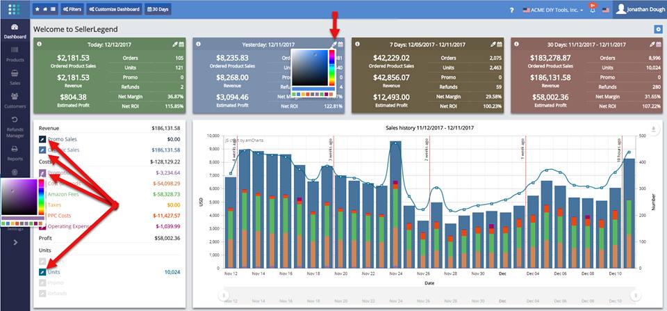
Notice the dashboard tiles have grown a colour eyedropper icon next to the calendar icon, this allows you to choose the dual-tone colour of each tile.
Each of the items on the Dashboard chart legend also has such an eyedropper, and with it, you can change the colour of every constituent part of the daily KPI bars.
If you think this feature was a waste of development time we could have better applied to more useful features, think again.
As we grow more successful in the WL part of our business, customizing the colour palettes to our white labellers’ specification was taking too much of our time. Now they can do it themselves too, without our assistance.